Introduction to Google Data Studio (Part 3) – Format your Google Data Studio Reports
Welcome back! We’ve reached the 3rd part of our series where we will now look at how to format your Google Data Studio reports. If you missed parts 1 and 2, you can read them here:
Part 1 – The pros and cons of Google Data Studio
Part 2 – Set up a basic report in Google Data Studio
We’ll now look at formatting the different elements of the basic report we created in part 2: text, date range, and finally the sample chart.
Here’s the link to log in, just in case you haven’t bookmarked it yet: Google Data Studio
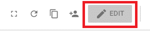
There’s one quick thing I want to mention before we start. If you open a report you created previously, you will likely find that it’s in read only view. To change to edit, click the ‘Edit’ button at the top right of the screen.
Format text
If you didn’t set the formatting of your report title when you created it, don’t worry – it’s really simple to format it later. This is probably the easiest element to format in the report.
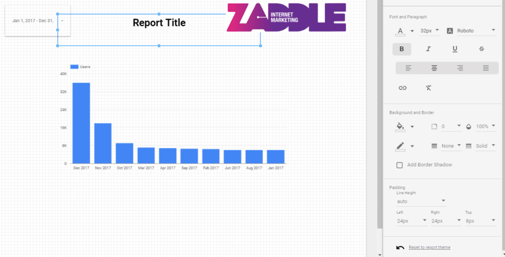
Click on the title text and you will see the formatting options appear in the right hand panel labelled as Text Properties.
If you’re not sure what any of the icons do, just hover your mouse over the icon and a tool tip will pop up.
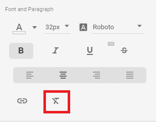
If you’re having problems with the formatting and you want to start again from scratch, the remove formatting icon is quite helpful. It will save you from deleting the whole text element.
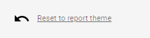
Another useful feature is the ‘Reset to report theme’ button which is located at the bottom of the format options panel:
And remember, anything you change can be undone using the undo button on the toolbar at the top of the report.
![]()
Format the date range
If you added a date range to your report, you may not be happy with the way it looks. So, let’s look at how to format the date range element.
Click on the date range on your report and you will see Date Range properties appear in the right hand panel. It defaults to the data tab where you can update the dates. If you click on ‘Style’, you will see the formatting options.
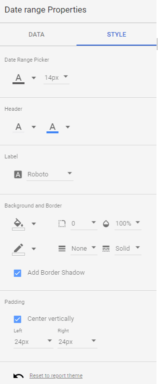
One of the default styles for the date range element is a border shadow. If, like me, you don’t like that formatting, you will need to un-check the ‘Add Border Shadow’ box to remove it.
As with the Title formatting, just use the undo button if you make a change you don’t like.
Format the charts
There are a lot more options for formatting the charts that you added to your report.
When you click on a chart, you will see 2 tabs in the right hand panel. The first is ‘Data’ which is where you can update the data being pulled into your chart. You can also change the chart type by clicking on the icons at the top of the right hand panel.
The second tab is ‘Style’ and that’s where you will find the formatting options for your chart.
At the top, you’ll find the bar chart options (these options will differ depending on the type of chart you chose).
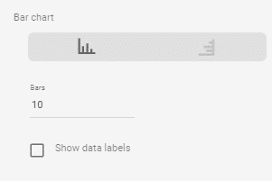
In this section, you can change your bars from vertical to horizontal, the number of bars displayed and whether you want to show the data labels on each bar.
The number of bars is an option that I have to change frequently as it will default to 10 even if I’m looking at 12 months of data. I would therefore change it to display 12 bars.
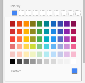
The next setting is where you can change the colour of the bars in your chart. In my sample report, I see one coloured box as I have a chart with only one series. You would see a coloured box for each series you add to your chart. Just click on the coloured box and a pop up colour palette will be displayed.
The next settings are relating to the axes.
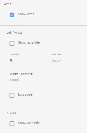
As you can see from the screenshot above, you can show or hide the axes. I usually keep the axes displaying but there may be times when a report may be better with the axes hidden.
The next set of options are for the Y axis. You can show or hide it, and you can also select the starting point of your axis. I tend to stick with 0 but if you’re dealing with very large numbers, it may make more sense to start higher. You can also set the maximum for that axis or leave it as auto.
Custom tick interval is the frequency of the ticks on the axis. I suggest leaving this blank to use the default unless you think your chart looks a bit odd!
Log scale makes the Y-axis scale logarithmic.
And finally in this section, you can choose to show or hide the X axis.
The next group of formatting tools is the grid styles.
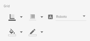
Working from the top left (l-r), the controls are:
- Axis colour
- Grid colour
- Font
- Chart background colour – note: this is just the chart area within the axes
- Chart border colour
Next, we have background and border options.
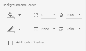
From top left (l-r), we have:
- Chart background colour – note: this is for the whole chart area including outside the axes
- Border radius – this changes your square border corners to rounded corners. The higher the number, the rounder the corner
- Opacity – this changes the opacity of the whole chart
- Border colour
- Border weight
- Border style – change your border from a solid line to dashes, dots or double lines
- Add a shadow to your border – the default for this is off
The final set of options is for the chart legend:
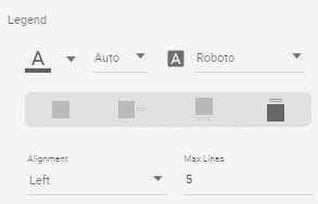
From top left (l-r), we have:
- Legend font colour
- Legend font size – this defaults to auto unless you change it
- Legend font
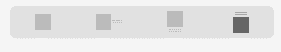
- Legend position
I often turn off the legend so it’s a useful option to know! Select the box on the left to hide the legend.
- Legend alignment
- Max lines – this setting defaults to 5
So, that’s it! How to format your Google Data Studio reports in a few easy steps.
We’ll be back soon with the fourth part of our series where we’ll show you how to add filters to your report and charts to break down the data e.g. by campaign.