Introduction to Google Data Studio (Part 2) – Set up a basic report in Google Data Studio
In part 1 of our Google Data Studio series, we looked at the pros and cons of the tool. If you missed part 1, you can read it here.
Our favourite thing about the tool is that once a report is set up, you can get near live data with just a quick change of the date range. So, it’s worth spending some time getting the set up right first as you will reap the rewards later!
So in this article, we’re going to walk you through how to set up a basic report in Google Data Studio from scratch. This should help give you an understanding of how the reports work and how to tweak the built in templates.
As a reminder, here’s the URL for accessing your Data Studio account: https://datastudio.google.com
How to set up a basic report in Google Data Studio
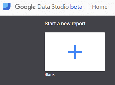
For this exercise, we’ll start with a blank report. To do this, click the “Blank Report” button on the dashboard.
You will be asked to add a data source. All the data sources that are connected to your Google account will be listed in the right hand column. Select the one you want to create a report for. If you can’t locate the correct source, click ‘CREATE NEW DATA SOURCE’ at the bottom of the column.
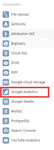
You will then see a list of possible data source types.
For this exercise, let’s use a Google Analytics source.
You will then see a list of the Analytics accounts you have access to. Select the one you want to add to the report. You will then see the list of properties under that account. Select the correct one and then the relevant view for your report.
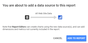
Once selected, click ‘CONNECT’ in the top right of the screen.
On the next screen, click ‘ADD TO REPORT’ at the top right of the page and then confirm that action when a box pops up.
You will then see a blank report with a grid to help you position your report elements. If you prefer not to have the grid visible, you can toggle it on and off via the ‘View’ menu.
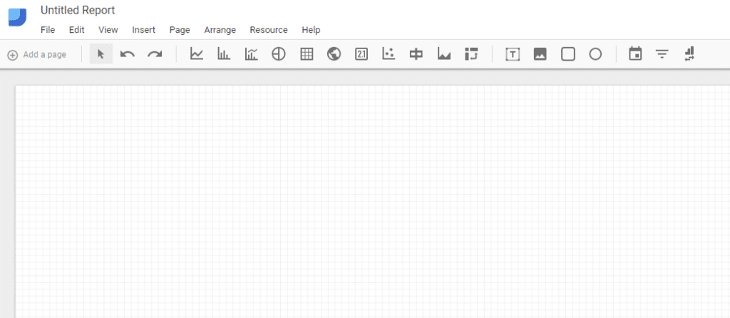
If you hover your mouse over each icon, it will tell you what the icon is for. Here’s a quick run down from left to right starting with the arrow next to “Add a page”:
Selection mode, Undo, Redo, Time series chart, Bar chart, Combo chart, Pie chart, Table, Geo map, Scorecard, Scatterchart, Bullet chart, Area chart, Pivot table, Text, Image, Rectangle, Circle, Date range, Filter control, Data control
For this simple report, we will add text, an image, a bar chart and finally a date range.
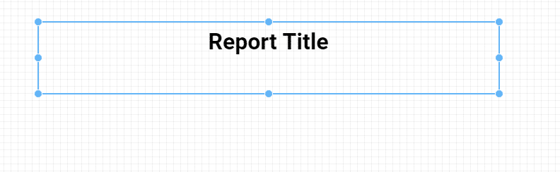
Add a report title
There are 2 ways to add text to a report. The first is clicking the Text icon on the toolbar. The second is to select Insert then Text from the menu.
![]()
Once you have selected the text tool, you will see the mouse cursor change to a +. Use your mouse to position and draw a text box on the blank report. If you’re not sure how big you want it to be, don’t worry as it can be changed later.
Once the text box is drawn, you can then add your text. Use the formatting tools on the right hand side of the window to make the text look as you want it to.
If you want to resize the text box, drag the corners or edges of the box to make it larger or smaller.
This would also be a good time to name your report for easy reference later. At the top of the page it says Untitled Report. Click in that field and change the text to your preferred title.
Add a logo or graphic
In the same way as you added text, select the image tool from the toolbar or the Insert menu and then draw an image box. Again, this can be resized if needed by dragging the corners/edges.
![]()
Once the image box is drawn, you will see a button in the right hand panel to select a file. Select the image from your computer or connected drive.

Add a bar chart
From the toolbar or insert menu, add a bar chart.
![]()
As with the other items we already added, draw a box to contain the bar chart. When you first add the chart, default information will be displayed. We will now change the data that is shown in the chart.
Let’s look at the monthly website visitors.
In the right hand panel, click on Source in the Dimension section – this section defaults to Source at the start when using a Google Analytics data source. Select “Time” and then “Month of Year”. The graph should change to show columns for each month of the current year as per this graph:
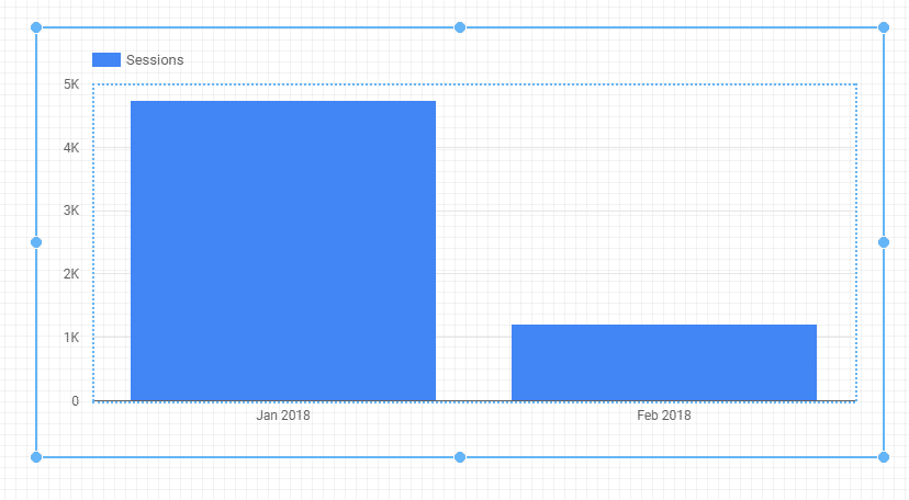
Click the back arrow at the top of the column to return to the data picker.
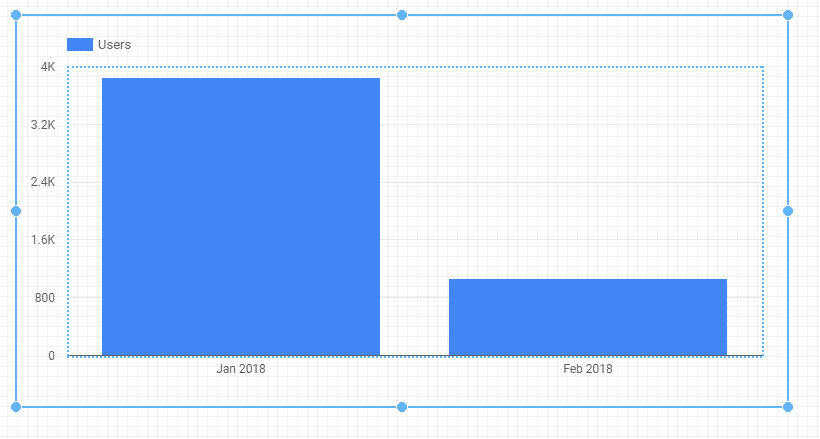
We’ll now change the default sessions to visitors by clicking on Sessions in the Metric section. Select User then Users. If you’re not sure which section the metric is in, you can search using the magnifying glass icon at the top of the panel.
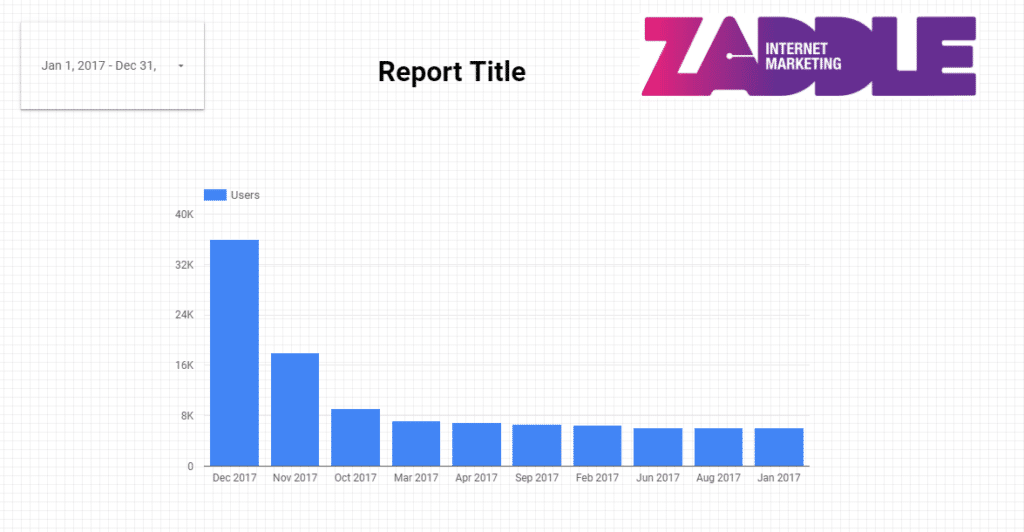
Your graph should now look similar to this :
Add a date range
As you can see from the above graphs, the report is defaulting to the current year. You can add a date range on a graph by graph basis but I tend to use a report level date range.
Select the date range tool from either the toolbar or the insert menu.
![]()
Draw a box to contain the date range. Once the box is inserted, you can set the date range in the right hand panel.
You have 2 choices:
Set start date and end date using the calendar tool.
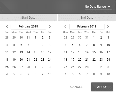
Or select a predefined date range by dropping down the arrow next to “No Date Range”.
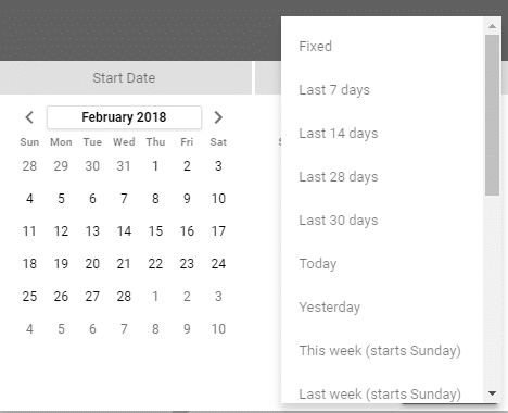
If you select last 7 days, last 14 days etc, this will dynamically update your data depending on when you view the report. If you need to keep a date range in place for more than the day you set it up, you’ll need to use the start and end dates.
Click Apply to save the change.
I selected last year so my report now looks like this:
So that’s how to set up a basic report in Google Data Studio! Have a go at adding some of the other metrics – it’s really easy to get the hang of and you’ll be adding multiple charts in no time at all.
In our next blog, we’ll be looking at some of the formatting tools for making your graphs and charts look more professional or on brand.
Happy reporting!